Green
Room

 |
Related Articles |  |
- Global Warming and the Thermohaline Circulation
- Interesting but questionable theories about the effect of global warming on ocean currents.
|
Recent Articles | |
- Gay Marriage, Traditional Marriage, and Musical Theater
- Understanding the opposition to gay marriage with a little help from "Fiddler on the Roof."
- Screensavers Considered Harmful
- Screen savers don't save your screen. They actually shorten the lifetime of your screen, and waste power to boot. In most cases, you'd do better to disable the screen saver and tell your computer to just power down the display instead.
- Explaining Orbits with Square Planets
- A basic physics lesson that takes a novel approach to explaining how satellites stay up.
- A Partial History of Computer Conferencing in Ann Arbor
- Recollections of some early on-line communities
- Do I Believe God Exists?
- Thoughts on the question of God.
Is Global Warming Real?
originally posted: July 12, 2004
last updated: February 12, 2006
This essay is a discussion of the evidence that (1) global warming is happening and (2) that it is being caused primarily by the human release of greenhouse gases. It concludes with a summary of what harm global warming might cause in the future. I do not claim to anything like an expert on this subject, or any subject closely related to this subject. (Well, OK, I once led a research project on computer modeling of environmental events). Writing this overview is, for me, a chance to develop my own understanding and opinions on the subject matter.
I plan to write at least two more essays on the subject of global warming. The first looks at a global warming scenario that is a bit more speculative than anything described here, the possibility that global warming could cause the North Atlantic Thermohaline Circulation to halt, triggering much more spectacular climate changes. The other will be an assessment of the impact of possible global warming scenarios on humanity. Eventually I'd like to get around to considering policy alternatives.
This Warming World
The most cited references in the climate change arena seem to be the reports from the Intergovernmental Panel on Climate Change. The IPCC was created in 1988 by two United Nations agencies, the United Nations Environment Program and the World Meteorological Organization. It's mission is not to do environmental research itself, but to produce an expert assessment and summary of all research being done worldwide for the use of policy makers. It's reports are the result of an open public process involving hundreds of scientists from many countries. It's last report consisted of four volumes and was published in 2001. A shorter version that gives just an executive overview is the Summary for Policy Makers. The next report is expected to be complete in 2007.
|
Variations in Global Surface Temperature from 1861 to 2001
|
| Variations in Northern Hemisphere Surface Temperature from 1000 to 2001
|
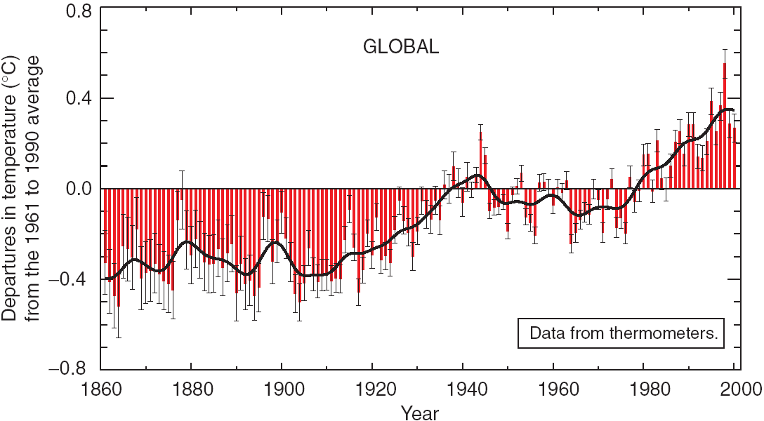

The top graph shows data for the last 140 years since accurate thermometer readings have been available. The red bars show the data values, with the thin black whiskers giving the 95% uncertainly range (generally larger for values further in the past). The bottom graph is only for the Northern Hemisphere, but spans the entire last thousand years. The earlier data is extrapolated from various data sources including tree rings, corals, ice cores and historical records. The grey region represents the range of uncertainty, which is, of course, much larger for this older data. On both graphs the black line is a smoothed average of the data.
Looking that the thousand year graph, we see that although there have always been temperature fluxuations, the two recent temperature increases, the first one from 1910 to 1945, the second from 1976 to the present, dwarf anything that has happened before. In fact, as of 2003, the five hottest years of the millenium were 1998, 2002, 2003, 2001 and 1995. New reports indicate that 2005 has broken all previous records, with an average global temperature higher than the El Nino year of 1998, although there was no El Nino to boost temperatures in 2005.
Hot Cities
Critics have claimed that what is really being measured here is a "heat island effect". Cities are well known to be hotter than the surrounding countryside. The higher temperatures readings might be simply because as time went on, more measurements were being taken in larger cities. All studies of historical temperature have included careful adjustments to try to accomodate this, but critics have claimed that these adjustments were too small.In response to these criticisms, further studies have been made which include only temperature readings from rural areas. These show the same pattern of global warming seen elsewhere. Historical temperature readings at sea, where there are no cities, also show the same warming trend.
Researchers have been mining every information source you could think of that might directly or indirectly provide more clues to historical temperatures. They've studied changes in the extent of snow cover and sea ice, the duration of lake and river ice, the retreat of glaciers the timing of bird migrations, sea levels, ocean heat content, percent cloud cover, the amount of rain fall, and the frequency of storms. All this data appears to confirm that there has been a substantial recent temperature increase, and little of it can possibly have been influenced by heat islands. There seems to be little basis for the belief that the heat island effect is the real cause of the temperature increases in the graphs above.
Cool Skies
There are a few areas where data does not appear to support the contention that the earth is getting warmer. By far the most important of these, and the source of by far the most debate, has been atmospheric temperature data. The data in the graphs above was all based on readings taken on the surface of the earth. Computer models predict that temperatures in the lower reaches of the atmosphere should follow the same trends, but it's not clear that they have done so.The lower region of the atmosphere, where the clouds are and where all weather takes place, is called the troposphere. Above it lies the stratosphere. The ozone layer is in the upper reaches of the stratosphere. Since 1979 we have had satellites collecting information on microwave emissions from oxygen in the atmosphere. John Spencer and Roy Christy used this data to compute global average temperatures in the the troposphere and stratosphere. Their data shows that the stratosphere is cooling, which was expected from the global warming models, but the troposphere shows only a very modest warming, which was certainly not expected. This is the one glaring disagreement between the climate models that predict global warming and actual observation.
There have been several challenges to their methods of computation, which must take into account differences in instruments and changes in satellite orbits. Some of these criticisms have been accepted by Spencer and Christy and incorporated into their calculations changing their results (their original paper reported a small decrease in troposphere temperatures not the small increase they now report). Some recent challengers claim current calculations of troposphere temperatures actually average in some stratosphere temperatures. If their adjustment is accepted, the results show temperature increases in the troposphere that are consistant with the global warming models. This is probably subject best left to the experts to duke out. As a complete non-expert, I was not entirely convinced by these newest computations. Spencer and Christy make more sense to me.
Some people have claimed that this controversy throws the entire theory of global warming into question. Several groups of scientists have studied the problem, including a National Academy of Sciences panel that concluded that this data does not justify seriously questioning the overall theory of global warming. The preponderance of evidence all points to global warming.
New theories have been put forth the explain the temperature discrepancy. Before 1992 the troposhere temperature appears to have tracked the surface temperature well. A volcanic eruption in the Philippines in 1991 is believed to have lead to ozone layer damage which increased cooling in the stratosphere, which may have cooled the troposphere, if not the surface. Such a temporary cooling of the troposhere would not permanently end global warming, only mask it for a while.
Ultimately we have to accept the fact that we will never know the average temperature of the globe precisely. There is no thermometer that gives that value. The number will always be an estimate resulting from a complex calculation, and will thus always be open to some degree of debate. Data from further in the past is sure to be even less certain.
The great majority of scientists studying the accumulated warming data, believe that it does add up to persuasive evidence of global warming. Some of the flakier critics claim that is just so they can keep getting funding for their reseach, but I'm not prepared to question the integrity of thousands of distinguished scientists world wide. Anyway, it's not as if there aren't organizations eager to give money and publicity to scientists who argue against global warming.
Who Turned up the Heat?
So if we accept that the world is warming, the next question is why. The timing certainly tends to suggest that it might have something to do with human industry, but that could be a coincidence. There are certainly plenty of wishful thinkers in the world who claim it is.
|
Contribution of Various Factors to Global Temperature Change from 1750 to 2000
|

Our first suspect is a group of chemicals known as "greenhouse gases". The sun's energy arrives at the Earth in the form of sunlight. After passing through the atmosphere, it is absorbed by surface land and water, warming the Earth. Eventually it is re-emitted, radiating out into space. For the Earth's temperature to stay the same, the amount of energy arriving from the sun and the amount of energy radiating back into space must remain equal.
The light being radiated out from the earth has substantially longer wavelengths than the light arriving from the sun. There are many chemicals in the atmosphere that allow the incoming radiation through, but trap the outgoing radiation. These are called "greenhouse gases". The more of these gases there are, the warmer the earth will be. The most important greenhouse gas is water vapor, but there are many others, including some man-made ones.
The bar for man-made changes in the levels of greenhouse gases is on the left side of the chart. It reaches upward into the red to indicate that it is a warming factor. The length of the bar is an estimate of how much warming has been contributed by changes in the level of greenhouse gases since 1750. A rather short green error bar indicates the degree of uncertainty in this estimate. As indicated along the bottom the chart, greenhouse gases have been well studied and their behavior in the atmosphere is well understood.
As we can see from the chart, the most significant of these is carbon dioxide (CO2). Carbon dioxide is the result of burning just about any organic compound. Organic compounds are made mostly of carbon and hydrogen. You can get energy by burning them in oxygen. The carbon combines with oxygen to produce carbon dioxide, and the hydrogen combines with oxygen to produce water. All animals use this reaction to get energy - they consume organic compounds and inhale oxygen, burn them for energy and exhale carbon dioxide. Plants, on the other hand, use the energy from sunlight to reverse the process, creating the sugars they need from carbon dioxide and water, and releasing oxygen as a waste product. Originally, the Earth's atmosphere was, like Venus's, mostly carbon dioxide. All the oxygen in it now was produced by plants, who, at the same time, removed most of the carbon dioxide (the oceans also absorbed a lot of carbon dioxide). Some of the carbon plants historically removed from the atmosphere has been trapped under the earth in the form of shale, limestone, coal, and oil. Burning coal or oil re-releases that carbon. Hydrogen is very light compared to carbon, so it is not surprising that when you burn an organic compound the amount of carbon dioxide produced has to be rather large - burning a gallon of gasoline releases about five pounds of carbon dioxide.
The concentration of CO2 in the earth's atmosphere has increased by 31% since 1750. It is currently at it's highest level in the last 420,000 years, and is increasing faster than it has at any time in the last 20,000 years. There is evidence that, in fact, we now have the highest concentration of CO2 in 20 million years.
Men diverged from apes only about 4.5 million years ago and homo sapiens is only about 120,000 years old, so that means that when you inhale, you are inhaling a substantially higher concentration of carbon dioxide than anyone in the history of the human species.
Other important greenhouse gases include methane (up 151% since 1750), nitrous oxide (up 17% since 1750), and various halocarbons. Halocarbons (including the "halon" used in fire extinguishers) are up since 1750, but have been declining since 1995. Since they contribute to ozone depletion, their use has been regulated. Unfortunately, the chemicals that replaced them, while not harmful to ozone, are greenhouse gases, and their concentration is rising.
These changes in greenhouse gas concentrations are all due to human activity. The burning of oil and coal is responsible for most of the increases in carbon dioxide and methane. Deforestation accounts for most of the rest of the change in carbon dioxide. Agricultural activities contribute additional methane and nitrous oxide. The chemical industry also releases nitrous oxide and halocarbons.
Second in the line up is stratospheric ozone. Ozone too is a greenhouse gas. The damage to the ozone layer in the upper reaches of the atmosphere, while otherwise undesirable, actually contributes to global cooling. The stratosphere is cooling both because with less ozone more energy is being radiated into space, and because higher concentrations of greenhouse gases in the lower atmosphere trap more heat lower down. But if the ozone layer recovers, as we hope it will, The stratosphere will likely warm up again.
Ozone in the lower atmosphere is our third suspect. Unlike ozone in the statosphere, it is on the increase not the decrease. Since it is a greenhouse gas, it contributes to global warming. Concentrations have increased 36% since 1750. It comes from motor vehicle exhaust and industrial emissions.
The next five characters in the line-up are less well understood. They are the aerosols, not gases but microscopic particles. They come primary from burning of fossil fuels and vegetative matter. They reflect incoming sunlight back into space, and so mostly contribute to cooling instead of heating. The "indirect effects" column refers to the tendancy of particles in the atmosphere to increase the size and number of cloud droplets and lengthen the lifetime of clouds. Water vapor in the atmosphere functions as a greenhouse gas and warms the earth, but clouds are made of water droplets, which block incoming solar energy, thus cool the earth. These indirect effects are poorly understood and are shown on the chart as a pure uncertainty bar, with no estimated value.
Airplanes also have effects on cloud formation, but this ends up being pretty negligable. As people put land to different uses, the amount of light reflected off changes. This seems to be a slight cooling effect overall.
The last suspect in our line-up is the favored son of those who don't want to believe in global warming. During the last century, the sun has actually been shining a bit harder (it does that from time to time), and this has, in fact, helped warm up the earth. In the final analysis, it turns out that we can't place all the blame on the solar suspect, however. First, as you can see from the chart, it isn't that tall. Second, the majority of the solar energy increase occured in the first half of the century, so it was likely a significant contributor to the warming between 1910 and 1945, but it cannot have contributed to the warming since 1976.
Adding all this data up turns out to be hard. Part of the problem is that while most greenhouse gases last a long time in the atmosphere and tend to spread themselves evenly over the planet, aerosols drop out of the atmosphere fairly fast and have more local effects. Lower atmosphere ozone tends to be short-lived and somewhat local too. It turns out that the same amount of heating or cooling in different parts of the earth can have different effects on the global climate (see my Thermohaline Circulation article for an extreme example of how the weather in Greenland could have profound effects on the global climate), so it matters where the warming is. You really need to fit all these factors into a computer climate model to see how they come together, and though our computer climate models are steadily improving, they still aren't overwhelmingly good.
There are still conclusions that we can draw however. There is almost no chance that the observed global warming is due to natural factors alone. For the last 50 years, there is really only one suspect for the cause of global warming. We are uncertain about the exact effects of aerosols, but we know that they result in a cooling effect, not a warming effect, and solar output has not increased in that time period. So the greenhouse gases must be the source of global warming.
The computer models we have indicate that the warming that would be caused by the greenhouse gases alone is as much or more than what has been observed. Adding in cooling due to aerosols gives a better fit. So the current line-up of suspects does appear to be sufficient to explain the warming that we have seen. However our data is not yet good enough to conclude with confidence that no suspects are missing from the lineup.
The Future
So there seems to be reasonably good evidence that man-made greenhouse gas emmissions, especially carbon dioxide emissions, are the primary cause of the warming that has been observed to date. We can then speculate about what the future holds.When you increase carbon dioxide emissions, not all of it ends up in the atmosphere. Higher atmospheric CO2 levels encourage more plant growth, and those plants absorb part of the additional carbon dioxide. Sea water absorbs a lot of carbon dioxide. Without these effects, our situation would be worse than it already is. However as we continue to release more carbon dioxide, these counter balancing responses will slow down. So carbon dioxide levels in the atmosphere are going to start growing faster even if our carbon emissions don't. This makes it much harder to predict exactly how much higher carbon levels will get.
Currently carbon dioxide levels are 31% higher than 1750 levels. Estimates for carbon dioxide levels by 2100 are between 90 to 250% higher than 1750 levels. Combining this with estimates of other inputs, researchers believe that average global temperatures are likely to rise by 1.4 to 5.8oC by 2100. This is a warming rate much faster than what we have seen to date, the most rapid temperature change in the last 10,000 years. Land areas are likely to warm faster than the global average. This is likely to be the most dramatic in the northern regions of North America and Asia, where temperatures are likely to increase 40% more than the worldwide average.
It's important to note that global average temperatures don't tell the whole story. The temperature changes will not be uniform. For instance, it appears likely that Greenland will be one of the areas that would experience larger than average temperature increases. This would mean that there would be more melting of the Greenland ice sheet than one would expect from the global average temperature increase, and thus greater rises in sea level. (There is enough water in the Greenland ice sheet to raise the sea level 7 meters, but full melting would probably take a thousand years or more.)
Rainfall is likely to increase substantially in the northern latitudes. At low latitudes the effects are likely to be more variable, increases in some places, decreases in others. Patterns of rainfall will likely become less regular - more droughts, more floods. Weather generally is going to be more variable.
There will be less snow and sea-ice in the Northern Hemisphere. Ice is likely to disappear from Greenland and the Artic ice cap due to warming, but the Antartic will likely gain ice from the higher rainfall. Global sea levels are projected to rise somewhere between 0.09 and 0.88 meters.
These changes will not be readily corrected. Almost a quarter of any increase in CO2 concentration will still be present centuries after the CO2 was released. This means that even if greenhouse gases were stabilized now at current levels, temperatures and sea levels will continue to rise for centuries, although at a much slower rate than if they are not stabilized.
These predictions are, of course, rather speculative. One shouldn't take them as advice to, for instance, build your new beach house at least 0.88 meters above sea level, but rather to give a general sense of the magnitude of the climate changes one can reasonably expect global warming cause. I plan to be writing another article soon in which I address the likely impact of these changes on humanity.